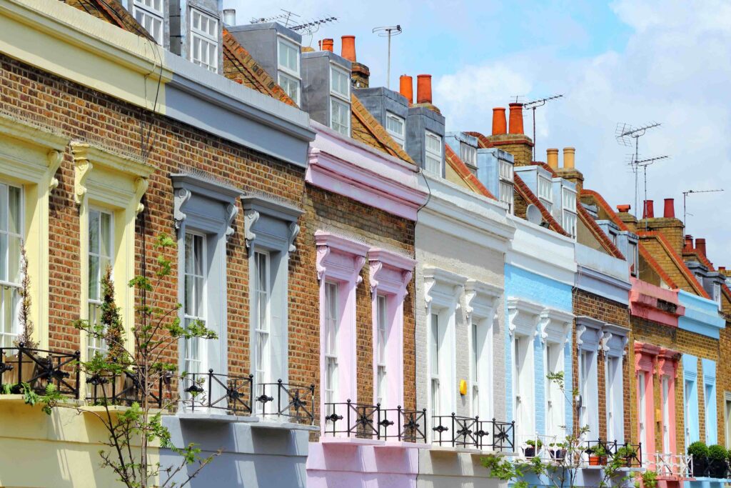
Victorian homes certainly have a way of turning heads – all tall sash windows, intricate brickwork, and grand facades practically begging for a show-stopping paint job. In Camden, they’re part of the scenery. But choosing the right colour? That’s easier said than done. Go too bold and you risk losing the period charm. Play it too safe and you’ll fade into the endless rows of terraces.
In this guide, we’ll explore the best Victorian exterior house paint colours for the year ahead, with inspiration drawn from the streets of NW1 and beyond.
Traditional & Period-Accurate
Deep Brunswick Green
When it comes to Victorian house exterior paint colours, Brunswick Green is about as authentic as it gets. It was a favourite for railings, window frames, and doors during the 19th century, and it still oozes period charm today. Pair it with cream or off-white masonry to highlight its richness, or with brass fittings for a touch of period glamour. The result is a scheme that’s a little bold, a little traditional, and perfectly suited to Camden’s characterful streets.
- Historically accurate period paint colour for Victorian homes
- Pairs well with cream or off-white masonry
- Works for trims, doors, and railings without overpowering the facade
- Adds elegance while keeping the design rooted in tradition

Hex Code: #254432
RGB: (37, 68, 50)
CMYK: 46, 0, 26, 73
HSL: 145°, 30%, 21%
Light Reflectance Value (LRV): Approximately 4.75%
Warm Stone Taupe
Warm Stone Taupe is one of those Victorian paint colours that never really goes out of style. The Victorians were fond of its earthy depth, and it still feels right as home on London’s terraces today. On a Camden street, it blends beautifully with brickwork while giving a subtle lift to the facade.
This Victorian house colour really comes into its own when paired with darker shades such as Charcoal Grey, Brunswick Green or Oxford Blue, which bring out architectural details and depth. For a softer look, pair it with creams or off-whites to keep things lighter and more traditional. Either way, it’s a shade that grounds a home without making it feel flat or dated.
- Timeless Victorian paint colour that blends with London’s architecture
- Works well with deep accent shades – charcoal grey, bottle green, or navy
- Doesn’t show dirt as quickly – ideal for busy streets
- Creates a calm, elegant backdrop for period detailing

Hex Code: #B8B1A3
RGB: (184, 177, 163)
CMYK: 0, 4, 11, 28
HSL: 38°, 13%, 69%
Light Reflectance Value (LRV): Approximately 48.5%
Clotted Cream
Among the most versatile Victorian house exterior colours, clotted cream is a soft, warm shade that flatters any period property. It instantly brightens a facade, making even the most overcast of London days feel a little lighter. On Camden’s ornate terraces, it helps highlight mouldings and cornices without overpowering them.
As a period paint colour, the beauty of Clotted Cream lies in how well it works with accent colours. A bold red or deep heritage green front door can stand proudly against it, while intricate mouldings and cornices are instantly highlighted.
- Brightens darker streets without feeling stark
- Perfect for showing off decorative mouldings
- A safe yet stylish choice for period homes
- Works with almost any bold accent colour

Hex Code: #F7EED5
RGB: (247, 238, 213)
CMYK: 0, 4, 14, 3
HSL: (43°, 71%, 90%)
Light Reflectance Value (LRV): 85.55%
Sage Green
There’s something effortlessly calming about Sage Green. It’s soft, earthy, and never tries too hard – exactly why it works so well on Victorian homes. In areas like Camden, where leafy streets and red-brick rows sit side by side, this muted green feels like it belongs.
What makes it such a reliable period paint colour is its flexibility. Against red or brown brick, it blends beautifully, while with warm neutrals it feels soft and traditional. Pair it with a charcoal trim or darker doors, and suddenly the whole scheme takes on more depth.
- Stylish now and in ten years’ time
- Works with both brick and stone facades
- Flexible enough for walls, trims, or doors
- Easy to pair with neutrals or moodier dark shades

Hex Code: #A8B5A2
RGB: (168, 181, 162)
CMYK: 7, 0, 10, 29
HSL: (110°, 11%, 68%)
Light Reflectance Value (LRV): 45%
Bold & Statement-Making
Oxford Blue
There’s something undeniably striking about Oxford Blue. Darker than your typical navy, it has a richness that gives Victorian terraces real presence, particularly against the warm tones of London stock brick. Walk down a street in Camden and you’ll see how this Victorian house colour can feel both traditional and surprisingly modern at the same time.
Historically, Victorians leaned towards black for trims and doors, but Oxford Blue has become a gentler, more stylish alternative. Add crisp white woodwork if you want contrast, or pair it with brass knockers and railings for a touch of old-school glamour.
- A bold shade that adds depth and character
- A modern twist on traditional black trim
- Pairs well with white, cream, or brass accents
- Works on doors, windows, and ironwork

Hex Code: #1F3057
RGB: (31, 48, 87)
CMYK: (64%, 45%, 0%, 66%)
HSL: (223°, 47%, 23%)
Light Reflectance Value (LRV): Approximately 2.99%
Pomegranate Red
Pomegranate Red isn’t shy. It’s bold, warm, and instantly gives a Victorian home a sense of personality. The Victorians themselves were fond of rich reds for doors and trims, so it has a genuine period connection, but it still feels just as eye-catching on Camden’s terraces today.
Rather than covering whole walls, this Victorian house paint colour really shines in smaller doses. A front door painted in Pomegranate Red, or railings picked out in the same hue, looks fantastic against pale brick or soft cream masonry. It’s the kind of detail that makes passers-by stop and take a second look.
- Adds instant warmth and personality
- Steeped in Victorian heritage
- Creates eye-catching contrast with pale masonry
- Best kept for standout details like doors, shutters or ironwork

Hex Code: #9E2A2F
RGB: (158, 42, 47)
CMYK: (0%, 73%, 70%, 38%)
HSL: (358°, 63%, 42%)
Light Reflectance Value (LRV): Approximately 7.5%
Contemporary Twists
Dusty Pastel Pink
There’s something quietly charming about Dusty Pastel Pink. It’s soft and warm, but never sugary, which makes it surprisingly flattering on Victorian terraces. In Camden, where streets are already full of character, this shade slips in comfortably and adds just enough personality without feeling over the top.
It’s also a nice way to freshen up tradition. The Victorians leaned towards muted creams and greys, but this gentle pink gives a modern twist while still respecting the age of the building. Dark charcoal trims can sharpen it up, while simple white woodwork keeps the look light and balanced.
- Adds warmth without drawing out the details
- Complements the eclectic character of Camden terraces
- A softer alternative to the classic Victorian neutrals
- Pairs well with deep charcoal and crisp white detailing

Hex Code: #F1D0D6
RGB: (241, 208, 214)
CMYK: (0%, 14%, 11%, 5%)
HSL: (340°, 70%, 88%)
Light Reflectance Value (LRV): Approximately 85%
Charcoal Grey
Charcoal Grey has a certain confidence about it. It’s dark enough to stand out, but it doesn’t shout, and that balance makes it a great Victorian terrace paint colour. Put it next to red or brown brick and suddenly the whole facade feels sharper, more polished.
The Victorians themselves often chose black for doors and trims. Charcoal Grey takes that idea and softens it just a little, giving you a finish that feels both classic and current. Use it on a front door if you want impact, on window frames for something neater, or carry it through the ironwork for a cohesive look. It can be paired with Clotted Cream or Warm Taupe to lighten the scheme, then throw in brass hardware for a touch of glamour.
- Adds depth without dominating
- Complements red and brown brickwork
- A subtle update on the black trims of the Victorian era
- Looks smart with soft neutrals, or with pale walls and metallic accents

Hex Code: #7D8182
RGB: (125, 129, 130)
CMYK: (4%, 1%, 0%, 49%)
HSL: (180°, 1%, 51%)
Light Reflectance Value (LRV): Approximately 22%
Cool Mint
Cool Mint brings a bit of freshness to a Victorian terrace. It’s playful without being too loud, it lifts an exterior but doesn’t smother the architecture underneath. On Camden’s streets, with their mix of leafy corners and eclectic houses, this shade feels right at home.
It’s surprisingly versatile too. Use it on the walls for a softer, lighter look, or keep it to the trims and doors if you’d rather add just a splash of colour. Team it with Clotted Cream for something calm and balanced, or pair it with Charcoal Grey if you like stronger contrasts.
- Creates a light, airy feel
- Stands out on the street without clashing
- Works across trims, doors or full exteriors depending on how bold you feel
- Complements soft neutrals or contrasts with darker shades

Hex Code: #F1D0D6
RGB: (241, 208, 214)
CMYK: (0%, 14%, 11%, 5%)
HSL: (340°, 70%, 88%)
Light Reflectance Value (LRV): Approximately 85%
How to Choose Victorian House Exterior Paint Colours
Picking the perfect Victorian house exterior paint colour for your home isn’t just about what looks trendy this year – it’s about finding shades that work with the character that’s already there. These heritage homes come with sash windows, cornices and intricate brickwork baked into their design, so the paint should frame and flatter those details, not compete with them.
A good starting point is to look back at what was popular in the late 19th century. Deep, earthy shades and soft neutrals were often used, and they still sit beautifully alongside London’s stock brick and shifting light. If you live in a terrace, it’s also worth thinking about how your colour choice fits with the row as a whole. Camden looks its best when there’s variety, but also a sense of harmony from house to house.
Tips for Choosing Your Victorian Paint Scheme:
- Look to the past – old photos, heritage colour charts and even local archives are great for inspiration.
- Try it outside – colours change dramatically between sunshine and grey skies, so always test in natural light.
- Play up the details – trims in a contrasting shade can make cornices, columns or porchwork stand out.
- Mix eras carefully – a modern colour can look great, just make sure it still respects the building’s age.
Ready to give your Victorian home the fresh coat is deserves? A fresh lick of paint can do wonders. Whether you prefer a classic period shade or something with a bit more bite, there right colour will lift your home’s kerb appeal and show off its character.
We know Camden’s streets inside out, from the rows of terraces in Hampstead and Haverstock to the grand facades of Frognal and Bloomsbury. Our team specialises in exterior painting in Camden, helping homeowners choose colours that respect history while standing up to modern life.
Contact us today to get started
Ready to give your Victorian home the fresh coat is deserves? A fresh lick of paint can do wonders.